How to Create Wireframes That Sell: A Beginner’s Guide
Every successful digital product starts with a clear vision. But vision alone isn’t enough. To turn ideas into real, usable products, you need structure.
That’s where UX wireframing comes in.
Wireframes help shape your product’s layout, flow, and basic experience before design and development begin. They focus on what matters most: how users interact with your product.
Good wireframes do more than organise information. They influence decisions, accelerate testing, and build the base for products that convert.
This guide shows you how to create digital product mockups that look great and sell well.
What Is a Wireframe?
A wireframe is a simple, visual guide that represents the structure of a digital product.
It outlines:
- Page layouts
- Navigation paths
- User interaction points
- Content placement
Wireframes are stripped-back. They use basic shapes and placeholder text to focus on function over style.
Think of them as blueprints for apps, websites, and platforms.
Why Wireframing Matters

UX wireframing offers several key benefits:
- Identifies user needs early
- Highlights potential usability issues before coding starts
- Speeds up design and development processes
- Saves time and money by avoiding late-stage changes
- Aligns teams around a shared vision
Clear wireframes mean fewer surprises later — and a smoother path to launch.
Essential Steps to Create a High-Converting Wireframe
1. Understand the User Journey
Before drawing anything, map out the user journey.
Ask:
- Who is the user?
- What problem are they trying to solve?
- What steps will they take to achieve their goal?
Sketch simple flowcharts showing the user’s path through the product. Focus on actions, not features.
2. Choose the Right Wireframe Tools

Many wireframe tools are available, ranging from free options to professional platforms.
Popular choices include:
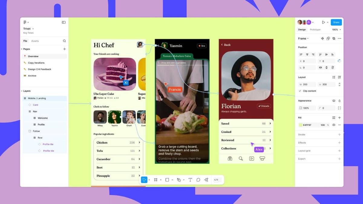
- Figma – Collaborative, web-based, and beginner-friendly
- Sketch – Powerful for Mac users
- Adobe XD – Integrated with the Adobe ecosystem
- Balsamiq – Perfect for low-fidelity, quick sketches
- Wireframe.cc – Minimalist tool for simple wireframes
Choose a tool based on your needs: collaboration, speed, fidelity, or integration.
3. Start with Low-Fidelity Wireframes
Begin with basic, low-fidelity wireframes. These are rough layouts without detailed visuals.
Focus on:
- Page structure
- Key elements (buttons, forms, images, text blocks)
- Content hierarchy
- User flows between screens
Use simple shapes: rectangles for images, lines for text, circles for icons.
Low-fidelity wireframes allow rapid testing and easy changes.
4. Define Clear Visual Hierarchy
Users should know at a glance what to do next. Your wireframe must make the primary actions obvious.
Key principles:
- Larger elements draw more attention
- Bold or dark colours highlight key actions
- Important items go at the top or centre
- Group related elements together
Clear hierarchy improves usability and boosts conversions.
5. Keep It Simple and Focused
Wireframes are not the place for detailed branding or visuals.
Best practices:
- Limit use of colours (use greyscale if possible)
- Stick to basic fonts and icons
- Avoid decoration or gradients
- Focus only on structure and flow
Remember: wireframes show what happens, not how it looks.
6. Annotate When Needed
If something in your wireframe needs explanation, add annotations.
Common annotations:
- Describing button behaviour (e.g., “opens a modal window”)
- Explaining dynamic content (e.g., “carousel rotates every 5 seconds”)
- Noting conditional elements (e.g., “this menu appears only after login”)
Annotations keep communication clear between designers, developers, and stakeholders.
7. Test and Iterate Early
Test your wireframes before moving into high-fidelity design.
How to test:
- Walk through the flow yourself — does it make sense?
- Share with colleagues for quick feedback
- Use simple usability testing tools (e.g., Maze, Useberry)
- Focus on navigation clarity, not visuals
Early testing prevents bigger problems later.
8. Move to Mid-Fidelity Wireframes
After testing, upgrade your wireframes slightly.
Add:
- Basic typography styles
- Clear button shapes and labels
- Form fields and input types
- Visual indicators for interactive elements
Mid-fidelity wireframes bridge the gap between rough sketches and polished prototypes.
9. Align with Business Goals
Wireframes must serve users — but they must also meet business needs.
Check that your wireframe supports:
- Primary conversion points (sign-ups, purchases, enquiries)
- Secondary goals (newsletter signups, social shares, upsells)
- Clear value propositions on key pages
If something doesn’t support a user goal or a business goal, consider removing it.
10. Prepare for the Handoff
When your wireframe is ready, prepare for handoff to designers or developers.
Key tips:
- Organise your wireframes logically
- Group screens by flow (onboarding, checkout, dashboard)
- Include annotations and flow charts if needed
- Label everything clearly (button states, error messages, links)
A smooth handoff saves time, reduces errors, and speeds up development.
Low-Fidelity vs. High-Fidelity Wireframes: What’s the Difference?
| Feature | Low-Fidelity | High-Fidelity |
| Purpose | Early structure and flow | Detailed design and interaction |
| Visuals | Basic shapes, no colours | Typography, branding, spacing |
| Tools | Balsamiq, Wireframe.cc | Figma, Sketch, Adobe XD |
| Best for | Testing ideas quickly | Preparing for development |
Start low-fidelity. Move to higher fidelity only after confirming structure and flow.
Real-World Example: Wireframing an E-Commerce Product Page

Step 1: Define user goal: Buy a product.
Step 2: Sketch basic layout:
- Product image
- Title and price
- “Add to Cart” button
- Short description
- Reviews
Step 3: Highlight primary action: Make “Add to Cart” the biggest, clearest element.
Step 4: Add navigation: Breadcrumbs at the top, related products at the bottom.
Step 5: Test flow: Click “Add to Cart” → Confirmation modal appears.
Simple, focused, and effective.
Mistakes to Avoid When Wireframing
- Adding too much detail too early
- Ignoring mobile-first design
- Overcomplicating user flows
- Skipping testing stages
- Designing for stakeholders instead of users
Good wireframes are clear, user-centred, and purpose-driven.
Build Strong Products from the Start
Wireframes are not optional. They are essential.
A good wireframe helps shape user experience, meets business goals, and saves time in design and development. By mastering UX wireframing, you set the foundation for digital products that not only look good — but perform.
Strong wireframes lead to strong conversions.
Choose the right wireframe tools. Focus on what users need. Keep your process simple and work together.


