Designing for Mobile-First: Why It Matters in 2025
In 2025, almost everyone uses a mobile device to browse, shop, and connect. Mobile is not a side option anymore — it is the first stop.
Mobile-first design means thinking about small screens before anything else. It makes sure your website or app looks good and works well on a phone.
Focusing on responsive UX and mobile user experience is now essential. If you want users to stay, engage, and act, mobile must come first.
This guide explains why mobile-first matters today, and how you can get it right.
What Is Mobile-First Design?
Mobile-first design means starting with the smallest screen in mind.
It asks: “What does a user need most when they open my site or app on a phone?”
Instead of shrinking a desktop website to fit a mobile screen, you design for mobile from the start. Then, you build up to larger devices like tablets and computers.It is a simple but powerful shift in thinking.
Why Mobile-First Design Matters Now More Than Ever
1. Mobile Is Where People Are
In 2025, more than 70% of internet traffic comes from mobile devices. Many users never touch a computer for daily browsing.
If your design does not work on a phone, you lose users before you even begin.
2. Search Engines Care About Mobile
Google now ranks websites based on their mobile versions first. This is called mobile-first indexing.
If your mobile site is slow, messy, or broken, your search rankings will suffer. Less traffic means fewer users and fewer sales.
Mobile performance is a direct ranking factor.
3. User Expectations Are High
Modern users expect speed, ease, and beauty on mobile.
If a page takes too long to load or if buttons are too small, users leave. Often, they do not come back.
A smooth mobile user experience is not a bonus anymore. It is the minimum.
4. Mobile Drives Sales
More people shop, book, and pay on mobile every year. In some industries, mobile accounts for over 60% of purchases.
A poor mobile design means lost revenue. A good one creates loyal customers who return again and again.
Core Principles of Mobile-First Design
1. Focus on the Essentials
Space is limited on mobile screens. Only the most important information and actions should appear first.
Tips:
- Keep pages short
- Show the most important button or link clearly
- Hide less important content behind menus or tabs
Less clutter leads to better results.
2. Make Everything Touch-Friendly
Users tap with fingers, not click with a mouse.
Best practices:
- Make buttons big enough to tap easily
- Leave space between links
- Give feedback when users tap (such as a small animation)
Good touch design feels natural and fast.
3. Design for Speed
Slow websites and apps drive users away.
Speed up by:
- Compressing images
- Minimising code
- Loading only what users need first
Aim for pages that load in under three seconds.
4. Build Simple Navigation
Navigation must be easy to find and simple to use.
Tips:
- Use a clear menu icon (the “hamburger” icon)
- Keep menus short
- Use back buttons and breadcrumb links
Users should never feel lost.
5. Design for One-Handed Use
Many users hold their phone with one hand. Important buttons and links should be within thumb reach.
Design for comfort by:
- Placing key actions at the bottom of the screen
- Avoiding top-heavy layouts
- Using swipe gestures carefully and clearly
Easy access keeps users engaged.
The Role of Responsive UX

Responsive UX means your product adapts beautifully to any screen size — mobile, tablet, or desktop.
It’s not just about shrinking or stretching layouts. It’s about rethinking how users experience content across devices.
Good responsive UX:
- Adjusts layout and content flow smoothly
- Resizes images and buttons without losing clarity
- Maintains fast loading speeds on every device
Responsive UX and mobile-first design work hand in hand.
Best Tools for Mobile-First and Responsive Design
- Figma: Collaborative, cloud-based design tool
- Sketch: Popular for Mac users and component design
- Adobe XD: Ideal for prototyping and responsive workflows
- Webflow: No-code platform for responsive websites
- Chrome DevTools: Built-in mobile testing environment
The right tools save time and ensure quality.
Common Mistakes to Avoid
Avoid these common errors in mobile-first design:
- Designing for desktop first, then squeezing it into mobile
- Using tiny buttons and hard-to-read text
- Ignoring slow loading times
- Hiding important features behind too many clicks
- Forgetting accessibility for users with disabilities
Good mobile-first design thinks about real users first.
Real Examples of Strong Mobile-First Design

Spotify
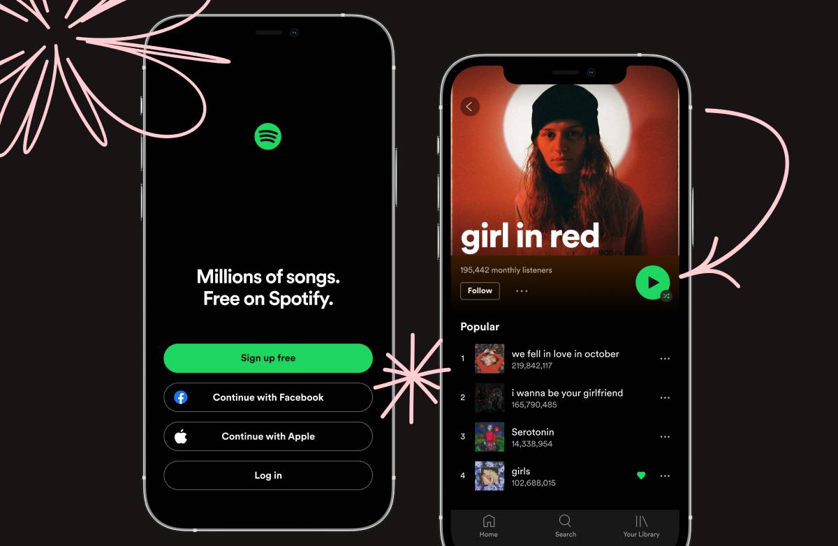
Spotify’s app is simple, fast, and touch-friendly. Search, play, and navigate — all within easy reach.
Airbnb
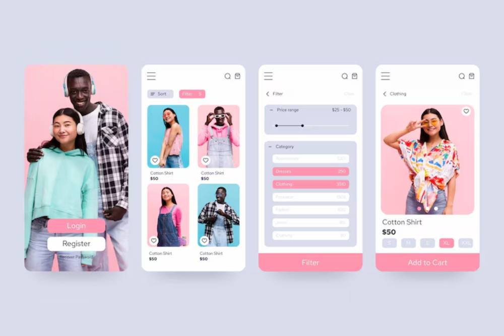
Airbnb’s mobile site lets users search, filter, and book with just a few taps. Clear navigation and strong visuals guide users through every step.
Duolingo
Duolingo keeps lessons short and interfaces clear. Big buttons, fast feedback, and fun interactions encourage daily use.
What to Expect Next for Mobile User Experience
In the near future, you will see:
- More voice-controlled apps
- Smarter AI-driven personalisation
- Augmented reality (AR) experiences on mobile
- Lighter, faster web technologies (like PWAs)
Staying mobile-first today prepares you for tomorrow.
Quick Mobile-First Design Checklist
- Is your key action visible without scrolling?
- Are buttons large and easy to tap?
- Do pages load in under three seconds?
- Is the navigation clear and simple?
- Is content easy to read on small screens?
- Is the mobile experience tested on real devices?
Use this checklist before you launch.
Mobile-First Is Business-First

Designing mobile-first is no longer optional. It is essential for success in 2025.
Mobile user experience drives traffic, engagement, and sales. Focusing on small screens forces you to focus on what matters most.
Responsive UX ensures every user, on every device, gets a great experience.
Good mobile-first design respects your users — and your future.
Call to Action
Building a new product?
Start with mobile-first. Keep it simple, fast, and easy to use.
Need a mobile-first UX checklist or a responsive design guide? Just ask — it’s ready to help your readers design better for 2025 and beyond.


