The Psychology Behind Successful App Interfaces
When you open an app and it just feels right — that’s not an accident. It’s the result of smart design choices rooted in psychology.
Understanding user behaviour design is key to building apps that users love. Every tap, swipe, and scroll is influenced by how the human brain works. Good app interface psychology turns confusing screens into effortless journeys.
This guide explains how UX psychology principles improve digital experiences. It shows why these principles can turn a simple app into a successful one.
1. Reduce Cognitive Load
Cognitive load is the mental effort needed to use an app. The more users must think, the more likely they are to give up.
How to lower cognitive load:
- Keep screens simple and focused
- Use familiar patterns and layouts
- Avoid unnecessary steps or information
- Break complex tasks into smaller stages
If users can act without stopping to figure things out, they are more likely to continue.
2. Guide Choices with Hick’s Law
Hick’s Law shows that decision time increases with the number of choices.
Apply it by:
- Limiting options on each screen
- Highlighting the most important action
- Using progressive disclosure to reveal details when needed
Simplifying choices speeds up decisions and keeps users moving forward.
3. Design for Fitts’s Law
Fitts’s Law explains that larger, closer targets are easier to tap or click.
Improve usability by:
- Making key buttons big and easy to reach
- Placing main actions where thumbs naturally land on mobile
- Separating actions to prevent mis-taps
Quick, accurate interactions build confidence in your app.
4. Create Clear Visual Hierarchy
Users should know what matters most on each screen without thinking.
Strengthen visual hierarchy by:
- Using size and colour to emphasise key elements
- Grouping related items together
- Placing primary content higher on the screen
- Leaving enough white space for clarity
When the eye knows where to go, the mind follows.
5. Build on Familiar Mental Models
Users come to your app with expectations based on past experiences. These mental models help them predict how things should work.
Design with familiarity by:
- Using standard icons like a magnifying glass for search
- Keeping navigation patterns conventional
- Naming buttons and links clearly
When users feel at home, they act faster and with more trust.
6. Use Colour Psychology Wisely
Colours influence emotions and actions. Choosing the right palette is a key part of app interface psychology.
Common associations include:
- Blue: Trust and calm
- Green: Growth and health
- Red: Urgency and importance
- Yellow: Energy and alertness
Use colour to reinforce meaning — not just for decoration.
7. Tap Into Emotional Design
People remember how an app makes them feel. Positive emotions create loyalty.
Enhance emotional connection by:
- Celebrating achievements with rewards or animations
- Writing in a warm, human tone
- Offering friendly error messages that guide, not scold
- Adding small, delightful surprises through micro-interactions
Good emotional design transforms apps into experiences.
8. Use the Reciprocity Principle
Reciprocity means that when users get something valuable, they are more likely to return the favour.
Encourage engagement by:
- Offering free trials, tips, or extras before asking for sign-ups
- Providing value early without demanding actions
- Rewarding loyalty with bonuses or upgrades
Generosity builds goodwill — and better conversions.
9. Build Trust with Social Proof
People often trust what others trust. Social proof reassures users that they are making the right choice.
Integrate social proof through:

- Customer reviews and testimonials
- Usage stats (e.g., “5,000 people signed up this week”)
- Trust badges and certifications
- Visible community activity
Seeing real-world approval lowers hesitation.
10. Use the Zeigarnik Effect
The Zeigarnik Effect suggests that people remember incomplete tasks better than completed ones.
Apply it by:
- Showing progress bars for onboarding or profile completion
- Sending reminders about unfinished actions
- Breaking journeys into clear steps to keep users engaged
Progress motivates people to finish what they have started.
Real-World Examples of UX Psychology in Action

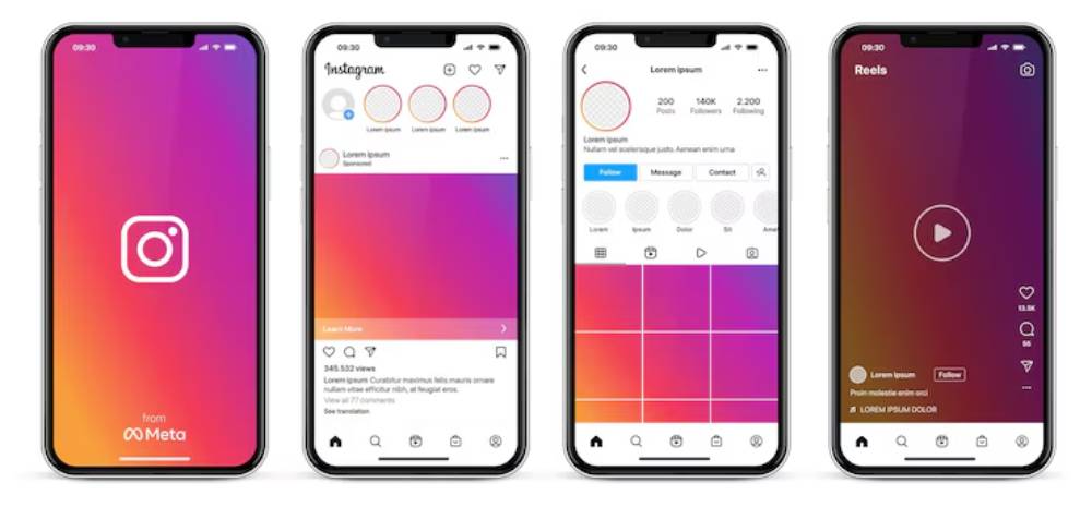
- Infinite scrolling leverages the Zeigarnik Effect
- Social proof appears through likes and comments
- Clean hierarchy guides users to post, like, and share easily
Airbnb
- Familiar layout patterns make navigation intuitive
- Emotional design phrases like “Live like a local” connect deeply
- Strong social proof through reviews and ratings builds trust
Duolingo
- Progress bars and streak counts use the Zeigarnik Effect
- Simple, gamified tasks lower cognitive load
- Positive emotional triggers keep users returning daily
Quick UX Psychology Checklist
- Is each screen simple and focused?
- Are choices limited and clear?
- Are important buttons easy to reach and tap?
- Does the visual layout guide the eye naturally?
- Are patterns and icons familiar?
- Does colour reinforce the right emotions?
- Are small achievements rewarded?
- Is early value offered before asking for action?
- Is social proof visible where needed?
- Are users encouraged to complete tasks?
Answering “yes” means your design aligns with human behaviour.
Common Mistakes to Avoid
- Overloading screens with too many choices or details
- Using unfamiliar navigation or icons
- Ignoring how colour affects mood
- Providing no feedback for actions
- Asking for user commitment too early
- Failing to show progress or rewards
Avoid these mistakes to create smoother, smarter interfaces.
Conclusion: Design for Minds, Not Just Screens

Understanding psychology is essential for designing successful apps. When you know how users think and feel, you can design journeys that are natural, helpful, and enjoyable.
User behaviour design and UX psychology are not extras. They are the core of effective, human-centred apps.
Align your app with these principles. You’ll build more than good design — you’ll build trust, loyalty, and growth.
Call to Action
Building or refining an app now?
Review your interface using these psychology principles. Focus on clarity, emotion, trust, and flow.
Looking for a printable checklist of app interface psychology techniques? Or maybe a starter guide on using UX psychology? Just ask — it’s ready to help your readers design smarter apps.
Just tell me when you’re ready for the next brief. Everything is in place to keep this standard going!


