How to Build a Landing Page That Converts
A landing page can either win you customers — or lose them in seconds. If you want real results, you need a page that captures attention, builds trust, and drives action.
The good news is, great landing page design is not about luck or guesswork. It is about using proven conversion optimisation tactics and strong call-to-action strategies.
This guide will walk you through simple, clear steps to create a landing page that turns visitors into loyal customers.
Pro Tip: You only have a few seconds to impress — make every element count.
Quick Guide: How to Build a High-Converting Landing Page
- Focus on one goal per page.
- Create a strong, clear headline.
- Use engaging, relevant visuals.
- Write benefit-focused copy, not feature lists.
- Place a bold, clear call-to-action (CTA).
- Keep forms short and simple.
- Build trust with testimonials, reviews, and guarantees.
Important: Simplicity wins. Every extra distraction costs you conversions.
Step-by-Step Guide to Landing Page Success
Step 1: Define One Clear Goal
A landing page should have one job — not five.
Common goals include:
| Goal | Action |
| Capture leads | Collect email addresses. |
| Sell a product | Push for immediate purchase. |
| Book a call | Get visitors to schedule a chat. |
| Register for an event | Drive sign-ups. |
Quick Tip: If you try to do too much, you end up doing nothing well.
Step 2: Craft a Compelling Headline
Your headline is the first thing people see — and it decides if they stay or leave.
Good headlines are:
- Clear: Say exactly what is on offer.
- Specific: Focus on benefits, not features.
- Urgent (when possible): Create a reason to act now.
| Weak | Strong |
| “Get Fit Today” | “Lose 5kg in 30 Days — No Gym Needed” |
| “Learn to Code” | “Build Your First App in Just 6 Weeks” |
Pro Tip: Promise value upfront — and deliver fast.
Step 3: Use Visuals That Support Your Message
Images and videos should boost your offer, not just fill space.
Smart visual strategies:
- Use real product images or demo videos.
- Show real people using or enjoying the product.
- Keep the style clean and consistent with your brand.
- Avoid stock photos that feel fake.
Important: Visuals should always point attention towards your CTA.
Step 4: Write Copy That Focuses on Benefits
Visitors do not care about features — they care about what those features do for them.
When writing copy:
- Start with the biggest benefit.
- Use bullet points for easy reading.
- Keep sentences short and active.
- Speak directly to the reader (“you”, “your”).
| Feature-Focused | Benefit-Focused |
| “24/7 Customer Support” | “Get help whenever you need it — day or night.” |
| “Mobile Responsive” | “Use it easily on any device, anywhere.” |
Pro Tip: Every line should answer, “What is in it for me?”
Step 5: Place a Strong, Clear Call-to-Action (CTA)
Your CTA tells visitors exactly what to do next.
Good CTAs are:
- Visible: Bright buttons with contrasting colours.
- Direct: Use action words like “Get”, “Download”, “Start”, “Book”.
- Simple: One action per page.
Best CTA examples:
- “Start Your Free Trial”
- “Get Instant Access”
- “Book My Consultation”
Warning: If users have to hunt for the CTA, you will lose them.
Step 6: Keep Forms Short and Sweet
Every extra field you add reduces conversion rates.
Form best practices:
- Only ask for what you absolutely need.
- Use placeholders to guide users (“Enter your email”).
- Consider multi-step forms if you need more info later.
| Fields | Conversion Rate |
| Name + Email | High |
| Name + Email + Phone + Address | Lower |
Quick Tip: If possible, let users sign up with one click via Google or social logins.
Step 7: Build Trust and Reduce Fear
People hesitate when they are unsure. Trust builders ease that fear.
Add trust elements like:
- Testimonials from real customers.
- Trust badges (e.g., security seals, award logos).
- Clear privacy statements.
- Money-back guarantees or free trials.
Sustainability Tip: Authentic, verified reviews work better than perfect but suspicious ones.
Recommended Tools for Landing Page Creation

Here are easy tools you can use to build high-converting pages quickly:
| Tool | Best For |
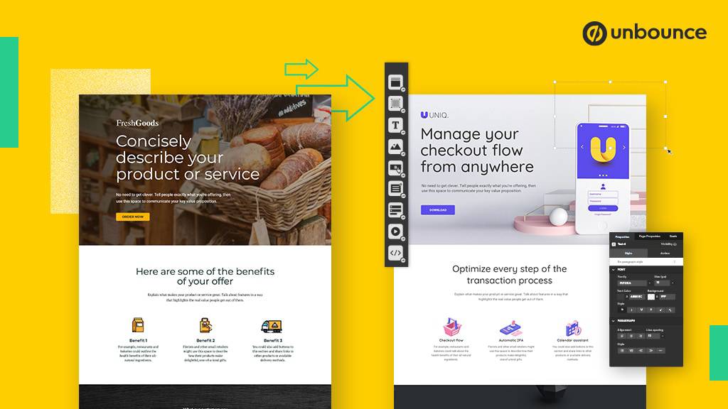
| Unbounce | Drag-and-drop customisation. |
| Leadpages | Quick templates and easy A/B testing. |
| Instapage | Professional designs with analytics. |
| Carrd | Simple one-page sites for startups. |
Warning: Design tools help — but great content and strategy matter more.
Frequently Asked Questions
How long should my landing page be?
As short as it can be — but as long as it needs to be. If the offer is simple, keep it short. If it is expensive or complex, explain more.
Should I put multiple CTAs on one page?
No. One page = one goal = one CTA. Multiple CTAs confuse people and lower conversion rates.
How can I test if my landing page works?
Use A/B testing. Change one thing at a time — like headline, CTA button colour, or hero image — and see what improves results.
What if I get traffic but no conversions?
Check if your offer is clear, if the CTA is easy to find, and if the landing page matches the ad or link that sent people there.
How important is page load speed?
Very important. A delay of even one second can lower conversions by up to 7%. Keep images optimised and pages fast.
Design Smart, Convert More

Building a landing page that converts is not about fancy tricks — it is about clarity, trust, and action.
By focusing on simple, proven conversion optimisation methods and strong call-to-action strategies, you can turn more visitors into happy customers.
Design clearly. Guide boldly. Convert wisely.


